The story behind our new look and feel
Refreshing brand identity is a curious business.
You start unsure about the destination and a little apprehensive. Like office relocation, most of us only do it a few times in our working lives. We have to trust others who have trodden the path many times before.
We were certain Proud were right for us. They quickly understood us and, importantly, liked what they saw. And, ironically, they weren’t proud people. They seemed pragmatic and down-to-earth, both things we saw in ourselves. And they recognised we weren’t trying to change the Incite we all love today. We just wanted to find a better reflection of who we are and our future ambition, and to show the great work we already do for clients in the best possible light.
We weren’t exactly sure where we would end up, but we had an idea we would know when we got there. Critically, beyond just liking our new brand, we wanted a system that worked together – was more than the sum of its parts. When anybody saw our website, business cards, ‘philosophy’ or PowerPoint decks, they had to see a close-knit family of stuff. And we wanted a look that transcended our logo. When someone saw an Incite chart, they had to know: “that’s an Incite chart” without looking for the brand name. And, of course, it had to work across our international offices.
While there was a long ‘To do’ list – logo, fonts, colours, PowerPoint, website and the rest – it wasn’t a case of starting at the beginning and ticking through them. Proud worked on each: finding out what we did and didn’t like about what we had already; proposing ideas, watching our reactions.
At the early stages, we had three possible logo ideas: the ‘i’s representing people; a dot between ‘in’ and ‘cite’ to emphasise pronunciation; circular and square tittles on the different ‘i’s. Each had merits and each had fans.
We were refining the colour palette, moving away from pastel shades towards something bold and vibrant that would work in bigger blocks, reflecting our confidence.
In PowerPoint we were playing with a grid system to break up slides into squares and rectangles, to make them less formulaic, more flexible and with added visual interest.
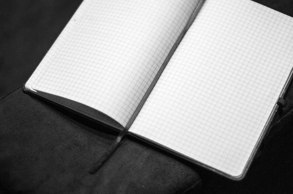
We looked at different style ideas. One was ‘friendly data’: pencil cases, graph paper, protractors and pairs of compasses, scientific, but accessible and human. It appealed and reflected our business and industry. Graph paper was proposed as an alternative to white. It felt different and ownable, but we weren’t all convinced yet…
As we looked at the logos we gave a simple challenge. The square and circle tittles looked clean. Could squares and circles reflect qual and quant, or us and clients? It still seemed a bit forced. Squaring the circle felt like a conceptual idea with legs. How could we give it real meaning and bring it to life? We needed a ‘thing’ to bring it together.
Proud came back with the evolved squaring circles idea, the animation and the five shapes.

Suddenly we knew we were close. We had a logo that now had, built into it, a reference to something very central to us: our consulting process. We had shapes that built our way of working into an inter-related whole. It also worked as a metaphor for what we do: make the complex simple.
And squares became more important. They were the end point. Graph paper had some internal visual consistency with the square that now represented ‘incite’ in our process.
We presented the graph paper internally. People liked it, but still needed convincing. Was it too scientific (somehow not qual enough)? Did it give a sense of ‘draft-ness’ (somehow sketchy and incomplete)? We’d taken some time to get used to it, so encouraged others to sleep on it too.
Our international colleagues had a range of views. In China, graph paper has a clear connection with learning to write Chinese characters. It reflects learning and persistence.
Then we saw how it could work in other places: on the website, on business cards, on letterhead. A recognisable system was coming together that delivered rich visual cues across media, and a look that was ownably, but understatedly, ours.
And finally, we looked at stationery (the stuff of friendly data) and another opportunity to deliver the brand tangibly. Graph paper was perfect to deliver real benefit in the form of branded notebooks.
A number of people have been involved in the process. We’ve debated everything from big ideas to key bits of copywriting to – literally – shades of grey. We haven’t agreed about everything, but we have agreed strongly about the direction of travel and the coherence of the end point. We’ve had more time than others to live with it and learn to love it.
No brand system stands up to scrutiny of the component parts. It’s a kit of parts that work together as a cohesive whole. No new brand can deliver familiarity instantly. Familiarity grows and, if there is resonance (without being too regimented), logic (without being too clever) and clarity (without being too obvious), a positive response will follow.
We hope you agree.
")
")
")
")